BattlePay started as a founder’s idea for a gaming payments platform, with no existing brand or product system. The business tension was building something playful enough for gaming culture and credible enough for payments.
Client
Battlepay
Timeline
2 Weeks
My Role
Brand Designer
Year
2025
MY ROLE
What Did I Do?
0 → 1 Design
Brand Design
High-fidelity prototypes
Scalable Design
Strategy
Ideation & Execution
Asset Building
Brand Book Design
BattlePay started as a founder’s idea for a gaming payments platform, with no existing brand or product system. The business tension was building something playful enough for gaming culture and credible enough for payments.
Client
Battlepay
Timeline
2 Weeks
Role
Brand Designer
Year
2025
Collaborators
Snehodeep Ghosh, Sourav Chanda
MY CONTRIBUTION
What Did I Do?
0 → 1 Design
Brand Design
High-fidelity prototypes
Scalable Design
Strategy
Ideation & Execution
Asset Building
Brand Book Design

CONTEXT
A Founder Idea With No Product Identity Yet.
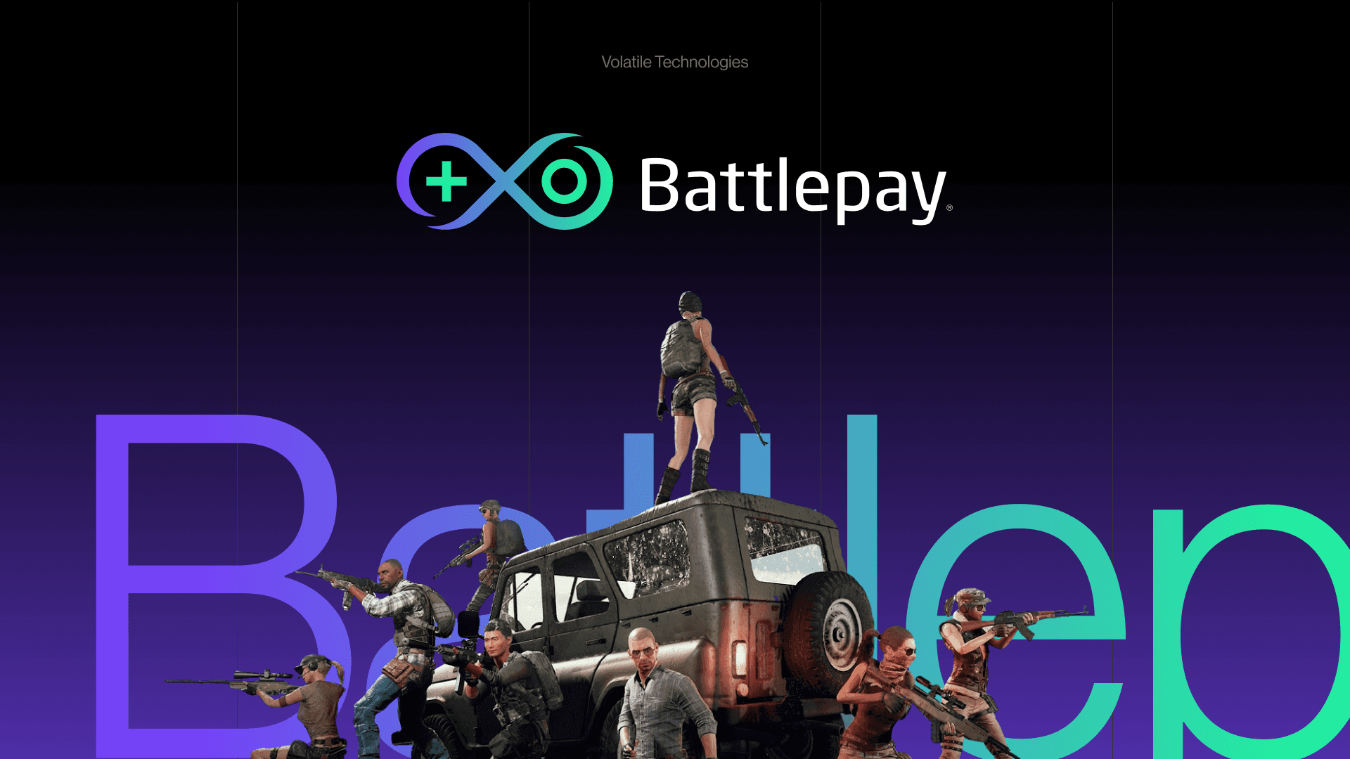
Battlepay began as a 0-to-1 brand for the gaming ecosystem: a way for gamers to connect, transact, and get better deals on in-game purchases. Volatile Technologies brought the founder vision; I had to turn it into a credible brand system and MVP direction with limited time, budget, and room for market confusion.
STARTING CONSTRAINTS
Timeline, Budget, Trust, And Gaming Culture.
The constraints were practical from day one: a short timeline, a lean budget, a strong founder vision, and a positioning challenge across SaaS, D2C, gaming, and payments. The brand needed to feel native to gaming without losing the reliability expected from a financial product.
“The identity needed to feel bold, digital-first, and credible while clearly communicating accessibility, rewards, and a strong sense of belonging.”
Why Pure Gaming Energy Was Not Enough
A pure gaming direction felt energetic but did not carry enough trust for payments. A pure fintech direction felt credible but too generic for the audience, so the visual language had to land between culture and confidence.
Why Pure Fintech Trust Was Not Enough
Gamers are handing over real money. The identity needed enough credibility and polish that users would trust it with transactions - not just follow it for its aesthetic.
WHY THE OBVIOUS DIRECTION DID NOT WORK
Loud Was Explored. Controlled Energy Worked.
The obvious route was to make it loud, neon, and aggressively gamer-first. That direction was explored and dropped because it made the product feel less reliable; the stronger answer was a sharper system where energy came from motion, colour, and tone while the core structure stayed trustworthy.
ONE DECISION
The Brand Had To Feel Fast Without Feeling Disposable.
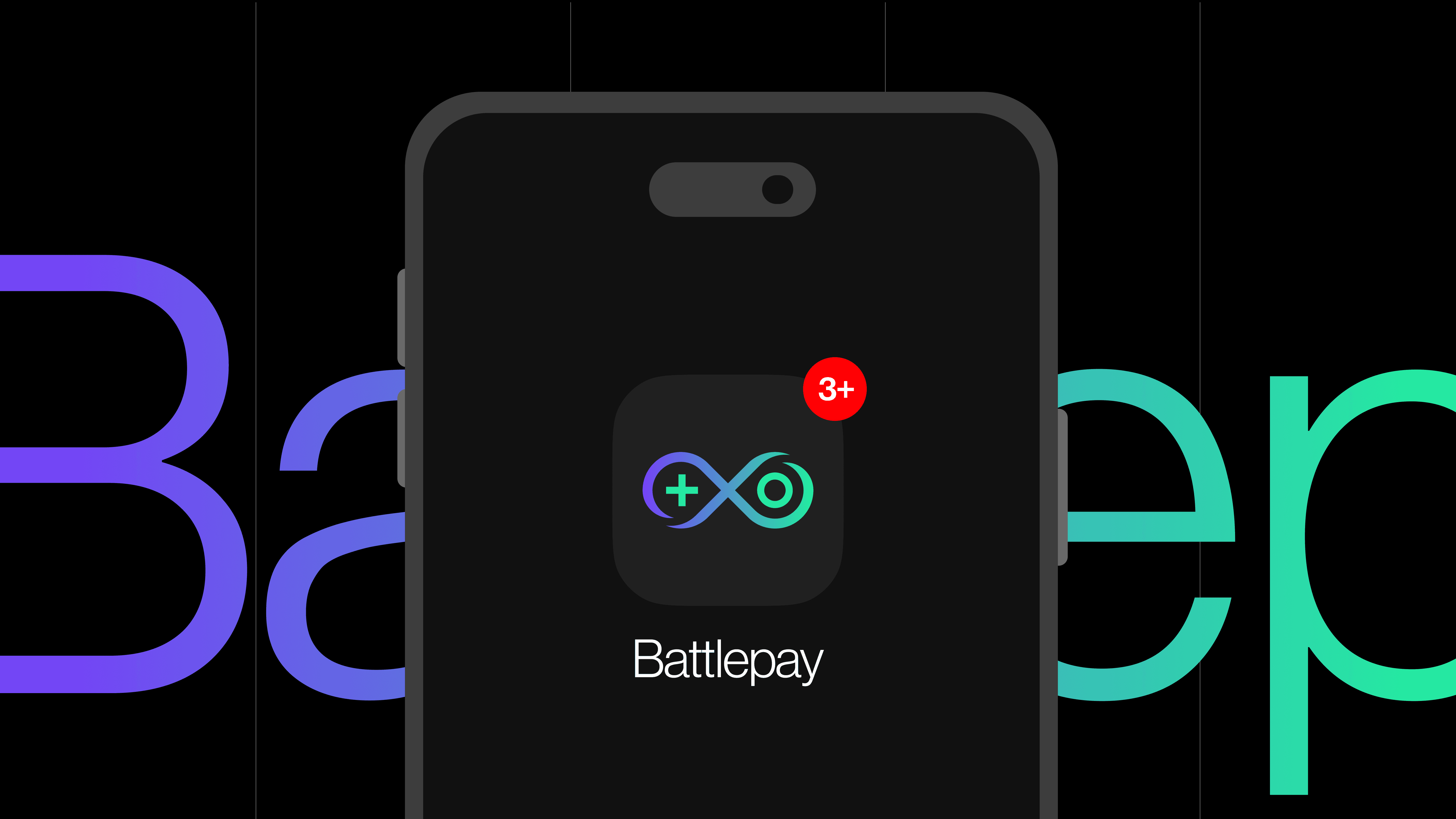
The key decision was to make BattlePay feel more like infrastructure for gaming than a campaign skin for gamers. Earlier directions leaned too decorative; the final direction used a tighter mark, clearer type, and controlled colour so the brand could scale from social posts into product UI.
Brief & Positioning
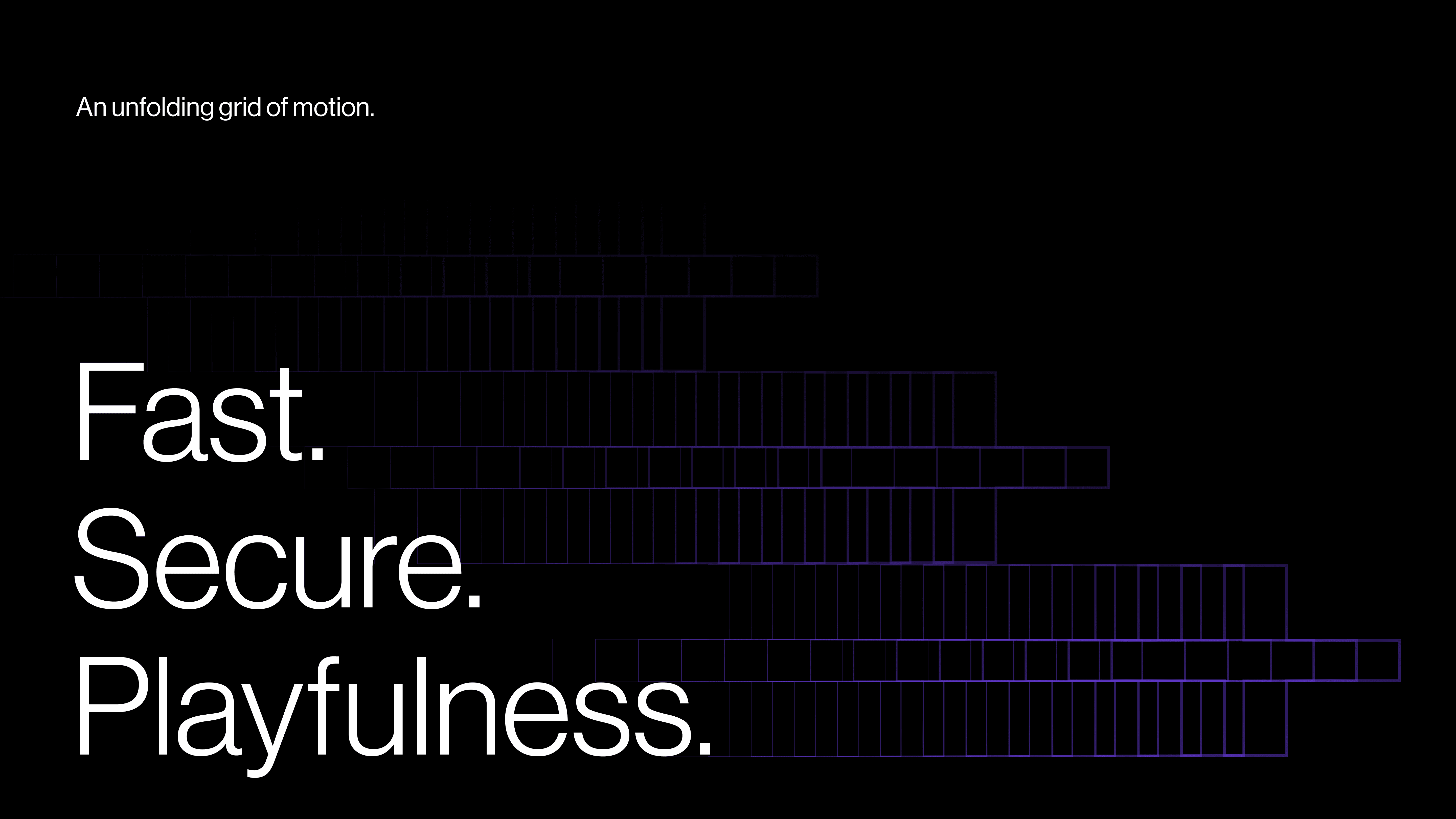
Defined brand values: fast, secure, playful
Logo & Mark
Symbol development, wordmark, logo system
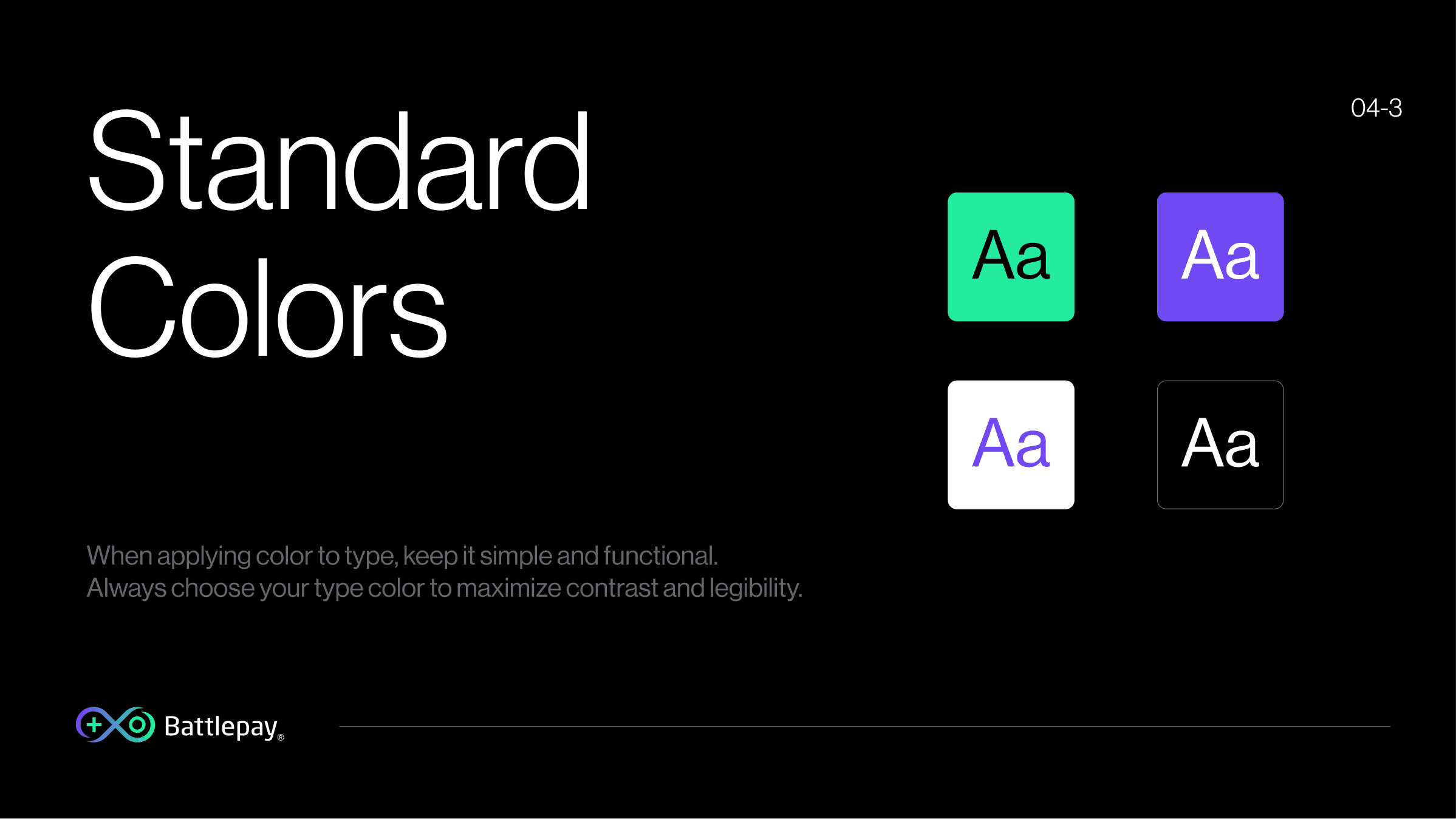
Colors & Systems
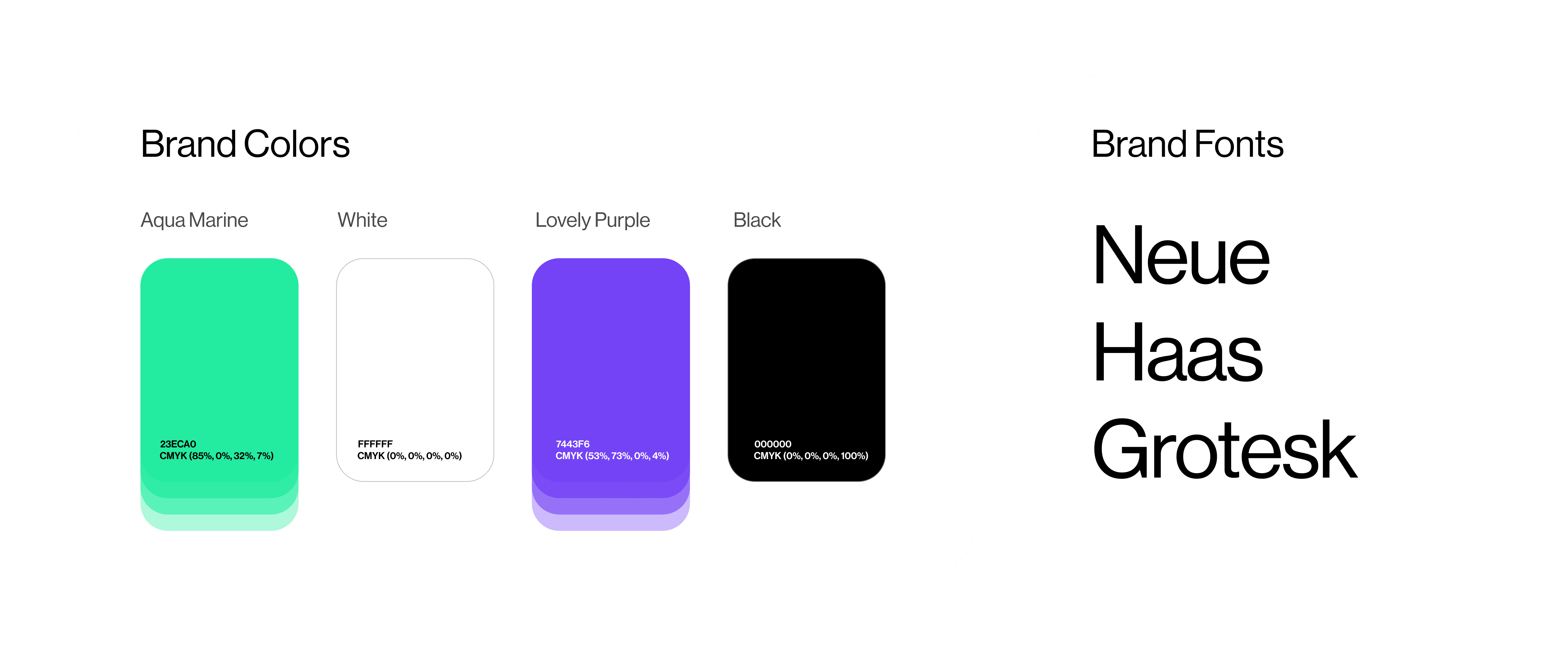
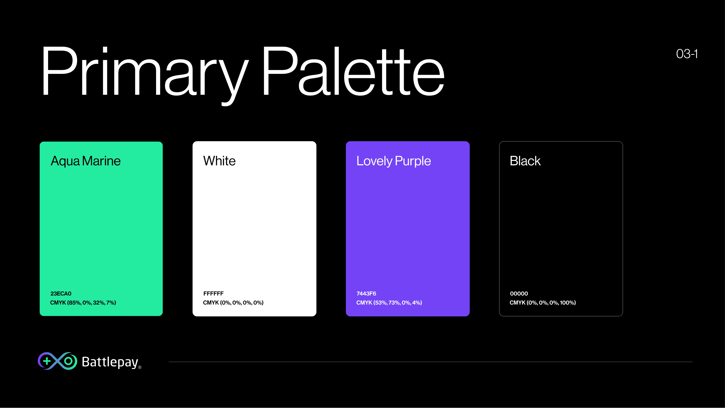
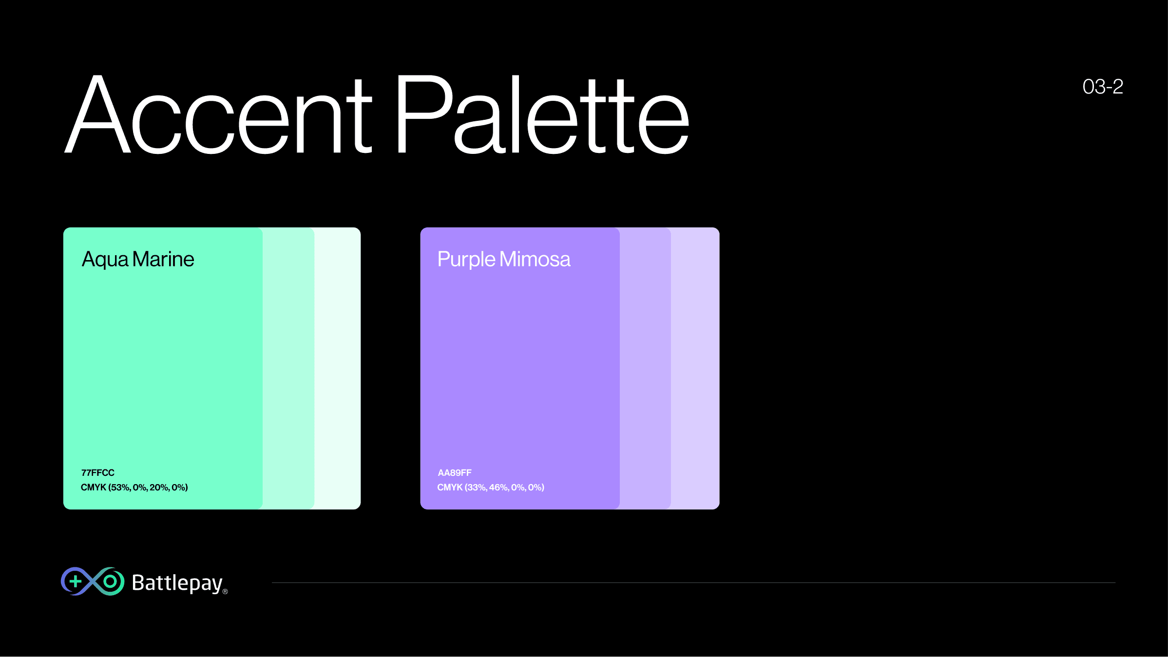
Palette definition, typeface selection, usage rules
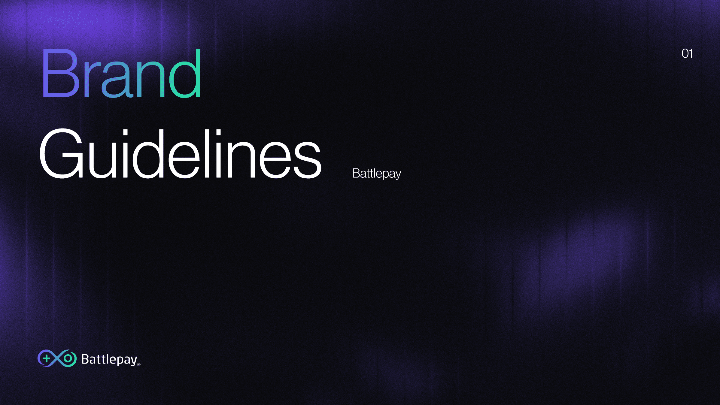
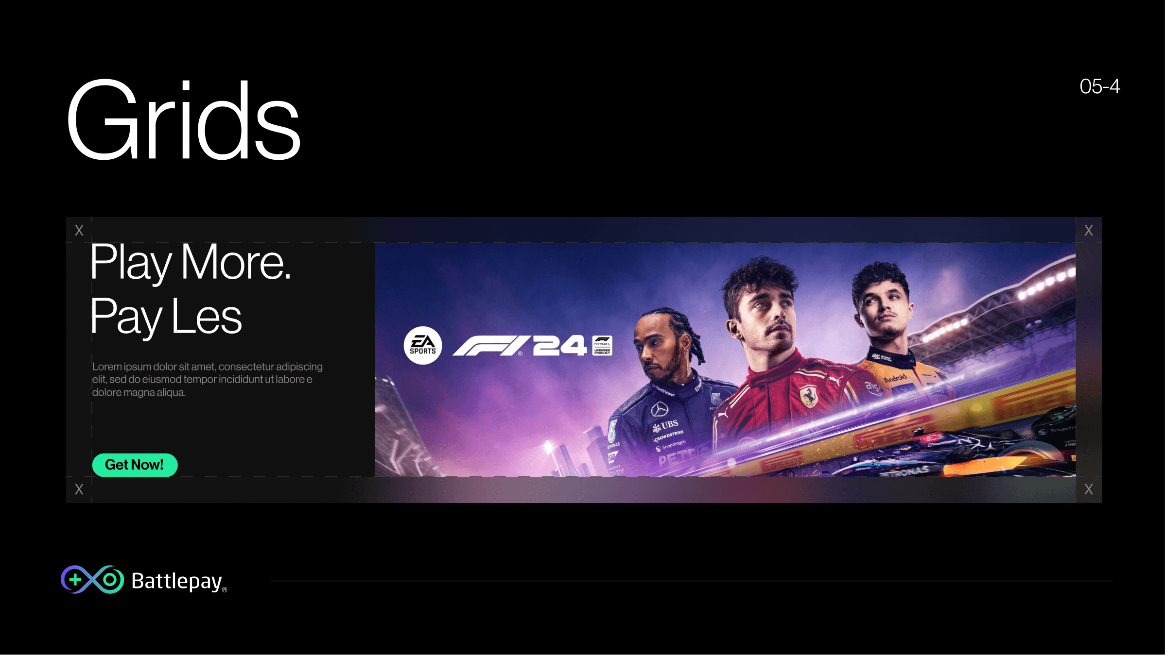
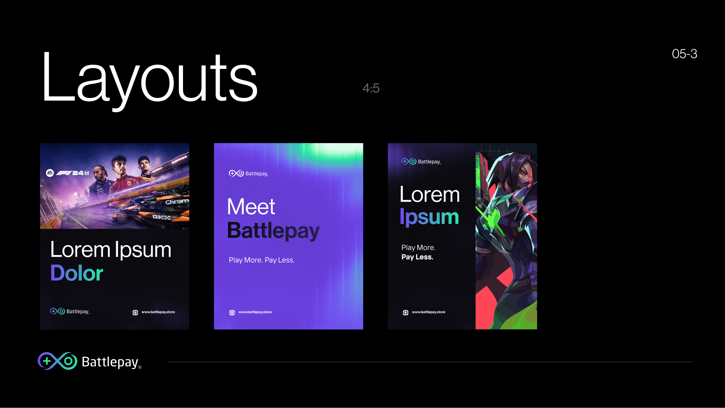
Brand Bible
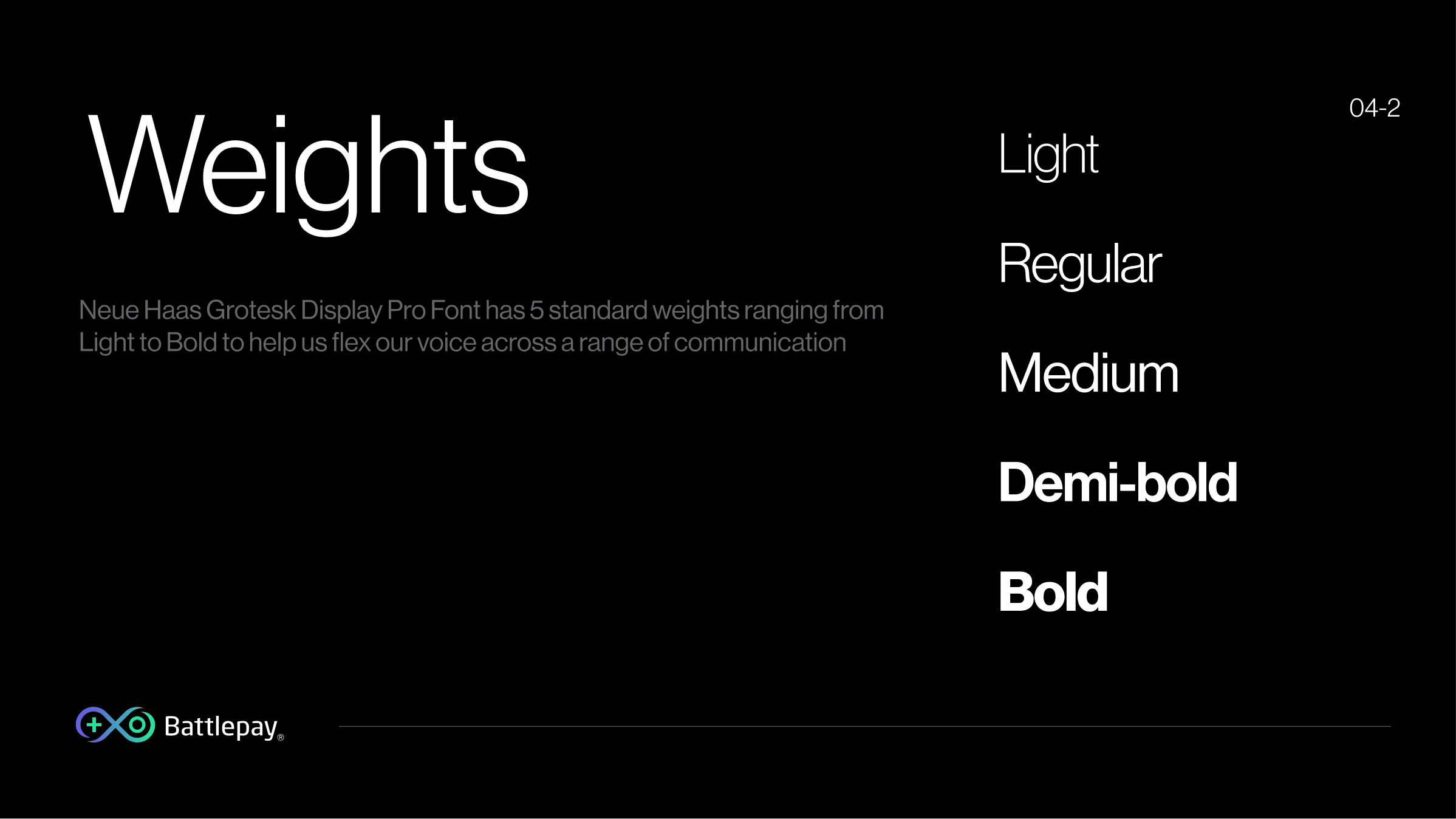
Grids, layouts, brand colours, weights, application
Social Kit & MVP
Full social template system + product UI application
THE SOLUTION
Brand System And MVP Built Around The Constraints.
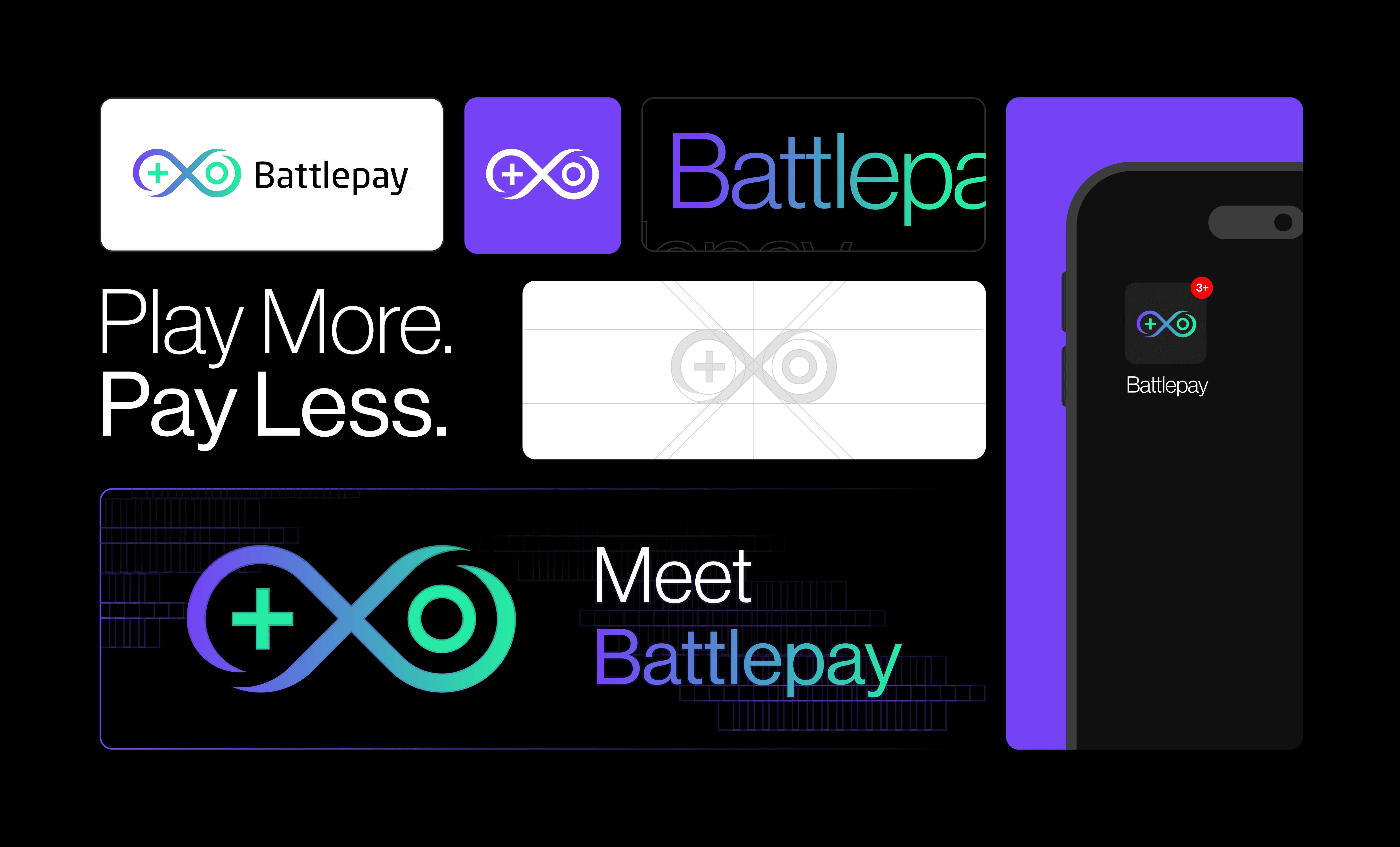
So the BattlePay system was built to scale from business cards and social assets to a full product UI. The brand bible gave the team rules precise enough to apply the identity confidently without a designer in the room every time.
THE IMPACT
A Brand And MVP Direction Ready To Ship.
Because there was no before-state to measure against, the impact was what shipped: a complete brand identity, brand bible, social kit, and MVP UI direction. The work turned a founder idea into a system the team could present, apply, and extend consistently. Reflection: this taught me that 0-to-1 branding is less about fixing what exists and more about choosing the constraints that future product decisions can grow from.
UP NEXT
EssentiallySports — Newsletter Design Systems
How improving engagement systems turned passive newsletter readers into active participants.
UP NEXT
Pine Labs — Product Communication
How product communication and visual sequencing made complex fintech stories easier to follow.
Have an idea in mind?
Let’s Talk!
& create something meaningful together




Made with ❤️, layers & late night coffees.
©2026, Suhail Quraishi
BattlePay began with no logo, no colour system, no visual language, and no finished product surface. The work was to turn founder vision into a brand and MVP direction that could stand in a crowded gaming and payments space.
Client
Battlepay
Timeline
2 Weeks
Role
Brand Designer
Year
2025
0 → 1 Design
Brand Design
High-fidelity prototypes
Scalable Design
Strategy
Ideation & Execution
Asset Building
Brand Book Design
MY CONTRIBUTION
What Did I Do?
CONTEXT
A Founder Idea With No Product Identity Yet.
Battlepay began as a 0-to-1 brand for the gaming ecosystem: a way for gamers to connect, transact, and get better deals on in-game purchases. Volatile Technologies brought the founder vision; I had to turn it into a credible brand system and MVP direction with limited time, budget, and room for market confusion.
STARTING CONSTRAINTS
Timeline, Budget, Trust, And Gaming Culture.
The constraints were practical from day one: a short timeline, a lean budget, a strong founder vision, and a positioning challenge across SaaS, D2C, gaming, and payments. The brand needed to feel native to gaming without losing the reliability expected from a financial product.
“The identity needed to feel bold, digital-first, and credible while clearly communicating accessibility, rewards, and a strong sense of belonging.”
Why Pure Gaming Energy Was Not Enough
A pure gaming direction felt energetic but did not carry enough trust for payments. A pure fintech direction felt credible but too generic for the audience, so the visual language had to land between culture and confidence.
Why Pure Fintech Trust Was Not Enough
Gamers are handing over real money. The identity needed enough credibility and polish that users would trust it with transactions - not just follow it for its aesthetic.
WHY THE OBVIOUS DIRECTION DID NOT WORK
Loud Was Explored. Controlled Energy Worked.
The obvious route was to make it loud, neon, and aggressively gamer-first. That direction was explored and dropped because it made the product feel less reliable; the stronger answer was a sharper system where energy came from motion, colour, and tone while the core structure stayed trustworthy.
ONE DECISION
The Brand Had To Feel Fast Without Feeling Disposable.
The key decision was to make BattlePay feel more like infrastructure for gaming than a campaign skin for gamers. Earlier directions leaned too decorative; the final direction used a tighter mark, clearer type, and controlled colour so the brand could scale from social posts into product UI.
Brief & Positioning
Defined brand values: fast, secure, playful
Logo & Mark
Symbol development, wordmark, logo system
Colors & Systems
Palette definition, typeface selection, usage rules
Brand Bible
Grids, layouts, brand colours, weights, application
Social Kit & MVP
Full social template system + product UI application
THE SOLUTION
Brand System And MVP Built Around The Constraints.
So the BattlePay system was built to scale from business cards and social assets to a full product UI. The brand bible gave the team rules precise enough to apply the identity confidently without a designer in the room every time.

THE IMPACT
A Brand And MVP Direction Ready To Ship.
Because there was no before-state to measure against, the impact was what shipped: a complete brand identity, brand bible, social kit, and MVP UI direction. The work turned a founder idea into a system the team could present, apply, and extend consistently. Reflection: this taught me that 0-to-1 branding is less about fixing what exists and more about choosing the constraints that future product decisions can grow from.
UP NEXT
EssentiallySports — Newsletter Design Systems
How improving engagement systems turned passive newsletter readers into active participants.
Have an idea in mind?
Let’s Talk!
& create something meaningful together
Made with ❤️, layers & late night coffees.
©2026, Suhail Quraishi